Google has updated its corporate logo for the first time in a decade.
Author - Mansur Ismagulov

The Tech AI
Get the key points in seconds - a short summary from The Tech AI.
The Google app update for iOS and Pixel features a new logo design with a gradient effect in red, yellow, green, and blue colors. This is the first major change since September 2015, when a sans-serif font and the "G" icon were introduced. The update makes the logo more harmonious in the Gemini style, but it is currently available only on the mentioned devices; the web version and other Android smartphones remain unchanged.
In the latest update of the Google app for iOS and Pixel smartphones, a new design has been introduced, where the red, yellow, green, and blue colors of the logo smoothly transition into each other, creating a gradient effect.
The previous major change to the Google logo occurred in September 2015, when the company switched to a new sans-serif font. At that time, the "G" icon was also introduced, combining the brand's signature colors.
Although the current update is not as radical, it makes the "G" more harmonious, aligning with the gradient style used in the Gemini logo design.
At this point, the new logo is only visible on iOS and Pixel devices, while on the web version and other Android smartphones, it remains unchanged.
Source: The Verge
The Tech on Telegram Follow The Tech on Telegram
Keep up with the latest technology and startup news.
Related reading





More from this author

News
zypl.ai begins operations in Japan and focuses on next-generation risk models
Mansur Ismagulov

News
Elon Musk's net worth has exceeded $700 billion for the first time
Mansur Ismagulov

Article Interviews
"Central Asian countries should build a joint ecosystem," — Bekhzod Ismoilov on the development of AI in the region
Mansur Ismagulov

Article Interviews
Bloom's Taxonomy and Engineering Levels: A Practical Growth Model
Mansur Ismagulov
Article Useful
How the IT industry in Azerbaijan developed in 2025: key events
Mansur Ismagulov
News
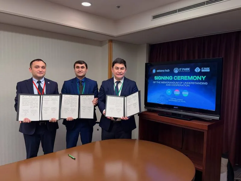
Tajikistan has become a new member of the regional innovation alliance Central Asian Innovation Hubs.
Mansur Ismagulov