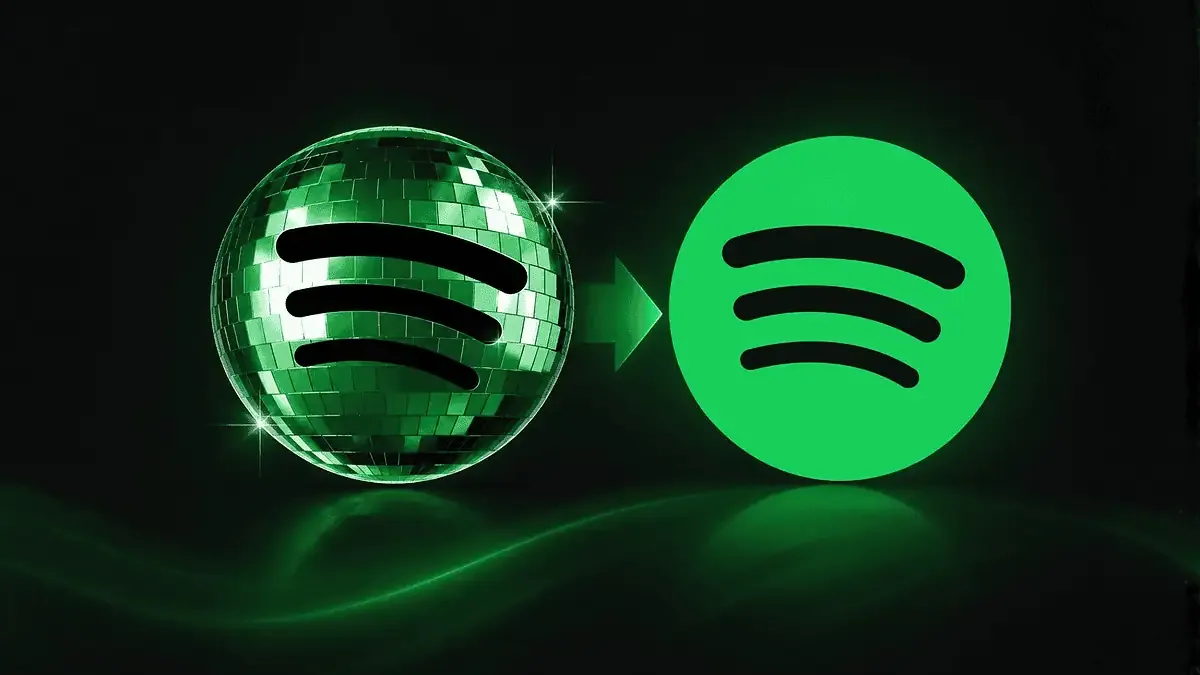
The updated icon appeared on iPhone and Android as part of the anniversary campaign “Spotify 20: Your Party of the Year(s),” celebrating the service’s 20th anniversary. Instead of the standard minimalist logo, users saw a shiny green disco ball with Spotify’s signature waves.
Many initially assumed the service was preparing for a full rebrand. This sparked active discussions on Reddit and X, where users commented that the new icon looked too bright, outdated, and clashed with the modern aesthetic of home screens. Some even compared the effect to an app that had frozen during loading.
Later, Spotify responded to user comments and clarified that the redesign was temporary. The company announced that the standard logo would return later this week.
The icon change is tied to Spotify’s holiday campaign marking the platform’s 20th anniversary. In addition to the temporary logo, the service also introduced nostalgic features allowing users to view their first-ever streamed track, listening history, and all-time favorite songs.
Source: MacObserver
The Tech on Telegram Follow The Tech on Telegram
Keep up with the latest technology and startup news.
Related reading




More from this author

Article Useful
How to protect your accounts from hacking: 8 settings you should check today
The Tech
Article Useful
500 Global: How the Accelerator Works and Who Can Receive Investments
The Tech

Article Interviews
Game Development in Central Asia: Arkady Moldavski on Developing Reverb and the Growth of the Industry
The Tech
Article Useful
Google, Tesla, BlackRock, and the IMF: Where to Apply for an Internship in Fall 2026
The Tech

News IT
Tesla unveiled the flying electric car Roadster
The Tech

News IT
Intero Biosystems startup won the Startup Battlefield at TechCrunch Disrupt 2026
The Tech